
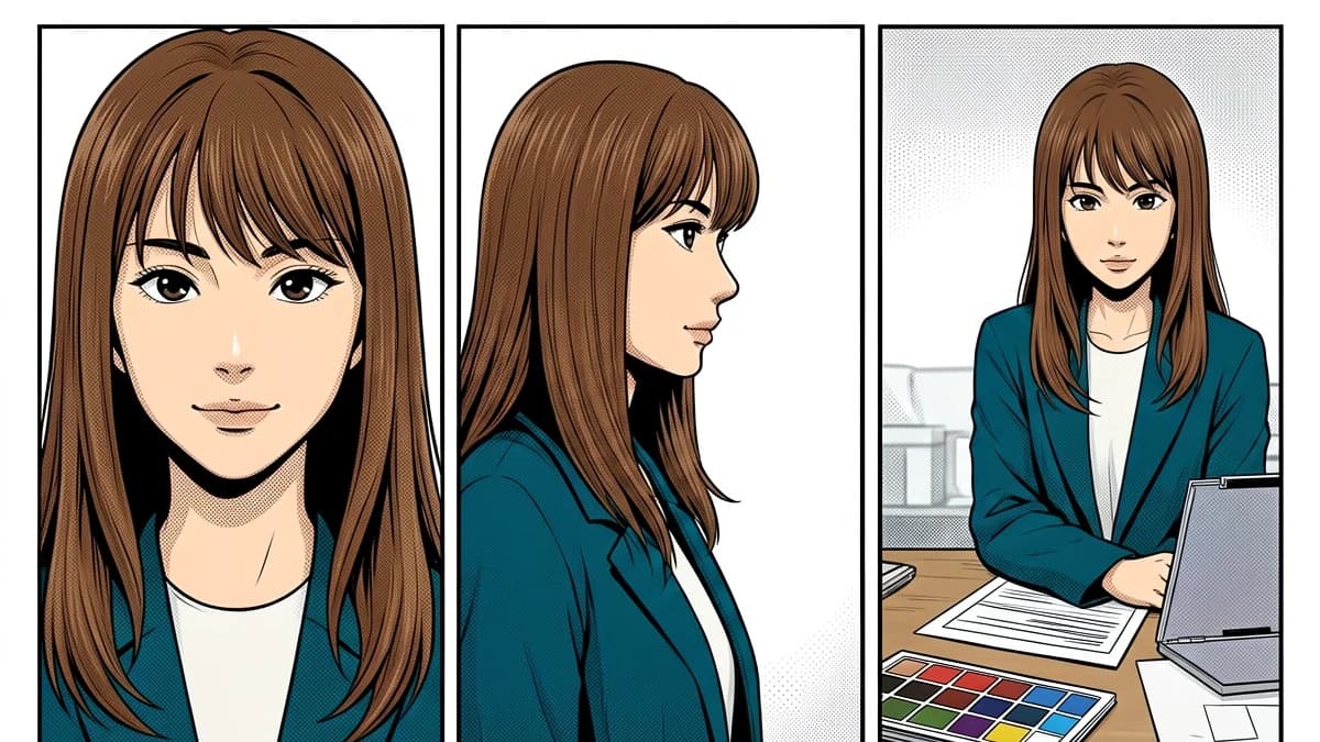
A character can look perfectly convincing in one panel and still be wrong for the story. The jacket shifts from slate blue to charcoal. Brown eyes turn amber on the next page. A skin tone that was neutral under daylight becomes pink indoors, even though the scene lighting does not explain the change. Readers may not name the exact error, but they feel that the character has slipped off model.
That is the real problem behind manga character color consistency. It is a continuity problem, not a hunt for one magical hex code. The useful unit is a small system: a palette sheet, a handful of approved lighting variants, a representative test page, and a review order that catches drift before it spreads through a chapter.
Start with identity colors, then let the scene change them
Separate every recurring color into two layers of meaning.
Identity colors belong to the character: base hair color, iris color, skin base, jacket fabric, uniform trim, jewelry, or a signature prop. These should remain recognizable from page to page. Scene colors belong to the panel: sunset, fluorescent light, rain, smoke, a spell effect, reflected neon, or a deliberate flashback treatment. They can push the identity colors warmer, cooler, darker, or less saturated.
This distinction solves a common argument during review. Instead of asking, “Is this blue correct?”, ask, “Is this the approved jacket blue under this scene’s light?” The first question invites taste. The second can be checked.
A practical character sheet should contain:
- canonical flat swatches for skin, hair, eyes, clothing, trim, and recurring props;
- a plain-language material note, such as “matte cotton” or “glossy black leather”;
- two or three accepted lighting variants tied to actual story conditions;
- two or three common off-palette shifts and the conditions that should trigger review;
- cropped reference panels showing the character in neutral light and one difficult scene.
The sheet does not need to become a design bible. One screen is often enough. It only needs to answer the decisions that otherwise get remade on every page.
No palette yet? Start with five or six identity colors: skin, hair, iris, main garment, trim, and one recurring prop. Save a neutral-light reference, duplicate the original file, and create separate base, light, and fixes groups. That is enough to test one page; add detail only when a repeated decision demands it.
Build a palette that survives real production
Color picking from an old finished panel seems quick, but it also picks up whatever lighting, blend mode, or export conversion affected that panel. The safer source is the canonical flat palette. For software-specific setup, consult the linked CLIP STUDIO coloring guide, studio-workflow guide, and Adobe swatch documentation. The production method below remains tool-independent.
Use swatches that are named by role, not by appearance. “Muted blue 2” is easy to confuse. “Mika_jacket_flat” is hard to misread. Whatever the software calls its reusable color feature, lock the approved palette or create a new version before changing a recurring color. This protects previous chapters from an accidental retroactive edit.
Keep two nearby groups:
- Character flats: the canonical colors that identify the character.
- Scene modifiers: overlays, grading colors, and effect palettes used for a location or sequence.
Do not bake the night tint into the jacket flat. Put the flat down first, then apply the scene treatment in a separate layer or group. A reviewer can temporarily hide the lighting and check whether the underlying identity colors still match the sheet.
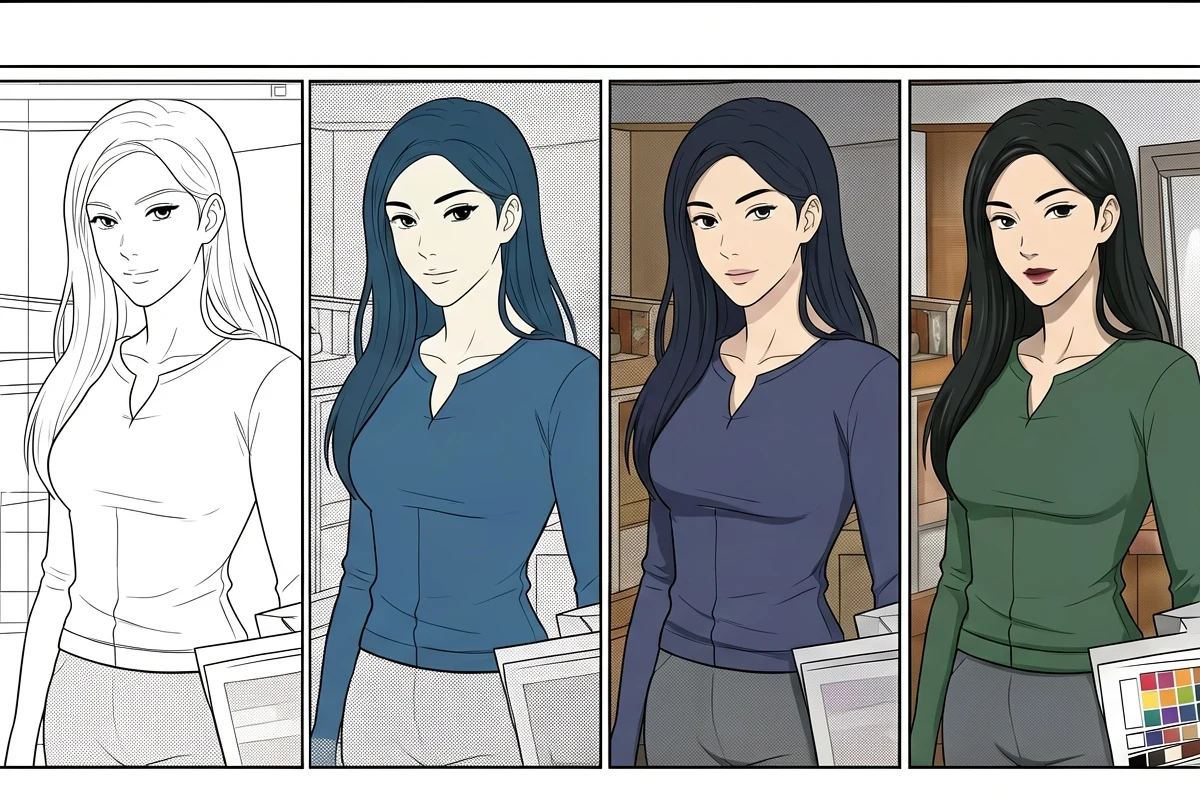
Choose one test page that can actually fail
The easiest page in a chapter tells you very little. Pick a page with several failure points:
- the recurring character appears in more than one panel;
- at least one face is small;
- clothing crosses a shadow or colored light;
- speech bubbles sit near hair or clothing;
- the page contains a background color that could contaminate the character;
- a previous chapter gives you a clear continuity reference.
Color this page before processing a full chapter. Review it at working zoom and at the size a reader will see on a phone. Thin line art, pupils, mouth shapes, and bubble edges can look intact at 200% and collapse at reading size. The linked webtoon page guide is optional software-specific reading; the practical check is simply to preview the exported page at its actual reading size.
The blocking decision should be clear. Line art, bubbles, identity colors, and readable values must pass before the workflow expands. Smaller issues can continue only when they are written into the correction log; “mostly fine” without a record is how one questionable page becomes a long correction list.
Review every page in the same order
A fixed review order prevents the most colorful part of the page from stealing attention.
1. Line art and dialogue areas
Check panel borders, facial features, hair strands, screentones, sound effects, and speech bubbles before judging the palette. If the drawing has been damaged or dialogue areas have been tinted, correct that first. A beautiful palette cannot rescue broken reading.
2. Flats and selections
Hide shadows and effects. Look for leaks, missed islands, swapped materials, and selections that cross line art. On a recurring character, compare skin, hair, iris, main garment, trim, and prop colors directly with the character sheet.
3. Identity under lighting
Turn the lighting back on. The scene may legitimately change the visible color, but the relationship between materials should remain believable. Dark hair should not suddenly read as a different hue family unless the story light explains it. Skin, white fabric, and metal should react differently rather than receiving the same blanket tint.
4. Value and focus
Convert a temporary copy to grayscale or squint at the page. The face, gesture, and dialogue path should still lead the eye. Consistent hue does not help if a new shadow pass hides the expression.
5. Neighboring pages
Review the accepted page beside the page before and after it. Many continuity errors are invisible in isolation. They become obvious when two close-ups of the same character sit next to each other.
This order turns color continuity into a checkable process. A reviewer can point to the stage that failed instead of leaving a vague comment such as “the colors feel off.”
Make handoff notes small enough to be used
For a solo creator, handoff means “future you on a deadline.” For a colorist and editor, it may involve several files and review rounds. In both cases, the notes should live next to the art, not in a message thread that disappears.
Keep five fields with every correction: current palette version, owner, reviewer, affected pages, and status.
Use predictable layer names:
CHAR_Mika_flatsCHAR_Mika_shadowSCENE_station_nightFX_phone_glowCORRECTIONS_2026-07-31
Add a short correction log when a mistake could recur:
Page 12: jacket drifted too green under station light. Keep the canonical slate flat; apply the green only through the scene-light group. Recheck pages 13 to 15.
That note is more useful than “fix jacket color.” It records the cause, the approved correction, and the range that may share the error.
Version the palette when the design truly changes. A damaged uniform, dyed hair, illness, time skip, or new magical state can justify a new canonical set. Name it with a story boundary such as Mika_after_ch18 rather than silently overwriting the old colors. Earlier chapters remain reproducible, and later pages stop arguing with the new design.
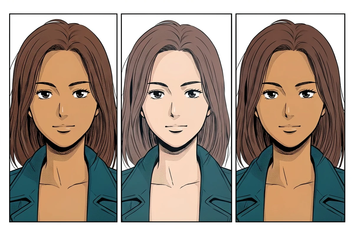
The comparison below isolates the failure: the drawing is unchanged, but the middle panel loses the approved skin, hair, and jacket relationship. Review pages at the same scale and against the same reference so a plausible-looking color drift cannot hide in context.
Where an AI color pass fits, and where it stops
Automated colorization can be tested as a first pass for manual review. VividManga currently lets you download a rendered WebP image rather than a layered working file. Keep the original layered file, and make material, lighting, and final production decisions in your own editor.
The paper “Comicolorization” is useful background on cross-panel color ambiguity, but it is not evidence that VividManga maintains character continuity. Evaluate that only on your own test page.
If you want to evaluate a first pass, use the single-page manga colorizer on the difficult test page. Compare it with the palette sheet and record the corrections. If it holds up, consider a small multi-page workflow trial rather than committing a chapter at once. Keep the original files and treat the human-approved page, not the raw output, as the reference for the next batch.
Before uploading unpublished work, read VividManga's Privacy Policy and Terms of Service. The policy currently says that inputs, outputs, and job metadata may be stored for history, support, abuse prevention, and product reliability, and that limited information may be shared with providers supporting storage and AI processing. Because those terms can change, check the current pages before sending confidential material. Upload only work you own or are explicitly authorized to send to an external service. If a client, co-creator, publisher, contract, or NDA does not allow that, use a public or non-sensitive test page instead.
Check one difficult page before scaling
Test a representative page, compare it with your character palette, and keep human approval in the loop.
PNG, JPG, or WebP under 5 MB works best.
Use this result to judge palette, line art, and speech bubbles before scaling.
Test one manga page, then compare it with your palette sheet
A compact continuity checklist

Before approving a page, ask:
- Are line art, screentones, panel borders, and bubbles intact?
- Do the canonical flats match the current character-sheet version?
- Are lighting changes separated from identity colors?
- Do skin, fabric, hair, and metal react as different materials?
- Does the face remain readable at mobile size?
- Does the page match its neighbors?
- Has any repeatable correction been added to the log?
- Is this page now the accepted reference, or does it still need review?
Keep an approval record that survives the next chapter
Keep the record compact enough to sit beside the art. A reusable header is:
Palette version | active chapter or scene | canonical flats | allowed lighting | reference file and panel | owner | reviewer | affected pages | status
Write corrections as actions. "Keep the jacket flat unchanged; add station light in SCENE_station_night" identifies both the editable layer and the color that must stay untouched. "Make the jacket more consistent" does neither.
Use a small trial batch before a full chapter handoff. Pick 6 to 10 panels that include a close-up, a small face, a shadowed costume, a speech bubble crossing the silhouette, and one difficult background color. Apply the current palette, export at the real delivery size, and compare the panels in reading order. Record each correction under one of four causes: wrong flat, selection leak, scene-lighting drift, or export shift.
If several panels share one cause, fix that stage once. A wrong jacket flat sends the batch back to the palette or selection source. A correct working file with a shifted export sends it to the color profile or export preset. Close the batch with one of three states:
- approved, with the current palette version frozen for the remaining pages;
- approved with named corrections that must be checked on every later page;
- rejected, with the workflow returned to the palette, lighting, selection, or export stage.
Use the same record for an automated first pass. Keep the result only if it shortens the correction list without damaging line art, text, or identity colors. If it fails, make layer, selection, lighting, and export changes in the original drawing file or reject the result; the rendered VividManga image is not a layered working file.
Frequently asked questions
Why can approved colors change after export?
A color profile, conversion, compression setting, or inconsistent export preset can shift the final image. Compare one approved working page with its exported copy on the same display and reuse the verified settings.
Can one approved page become the reference for a chapter?
Yes, when it contains the relevant character, materials, and scene light. The palette remains canonical; approve a new representative page when the location or lighting changes.
Choose one page that is likely to fail, place the compact palette beside it, and run the five-stage review. Expand only after the page has a recorded approval state.