
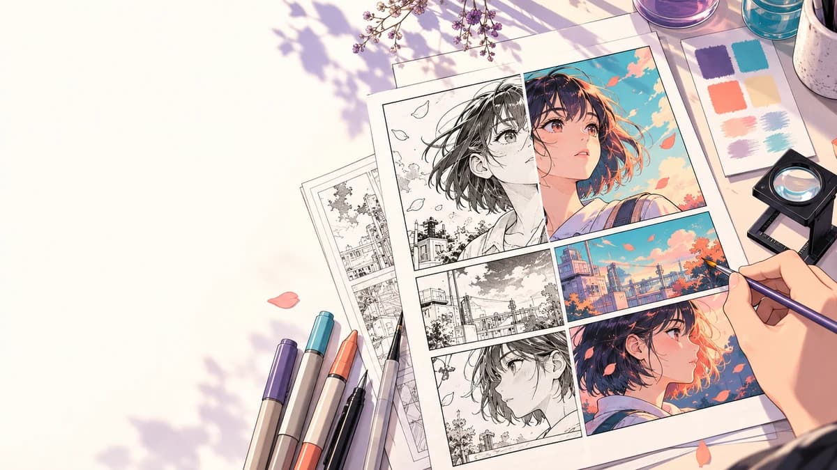
Learning how to colorize manga is less about finding one dramatic palette and more about making a series of controlled decisions. Line art has to remain readable. Character colors need to survive scene changes. Speech balloons cannot disappear into the background. A color pass that looks convincing on one close-up may fall apart on a page with small panels, effects, and dense lettering.
The most reliable approach is to start with one representative page, record the decisions that work, and only then color more pages. This guide explains that workflow for manual coloring, assisted coloring, or a mix of both.
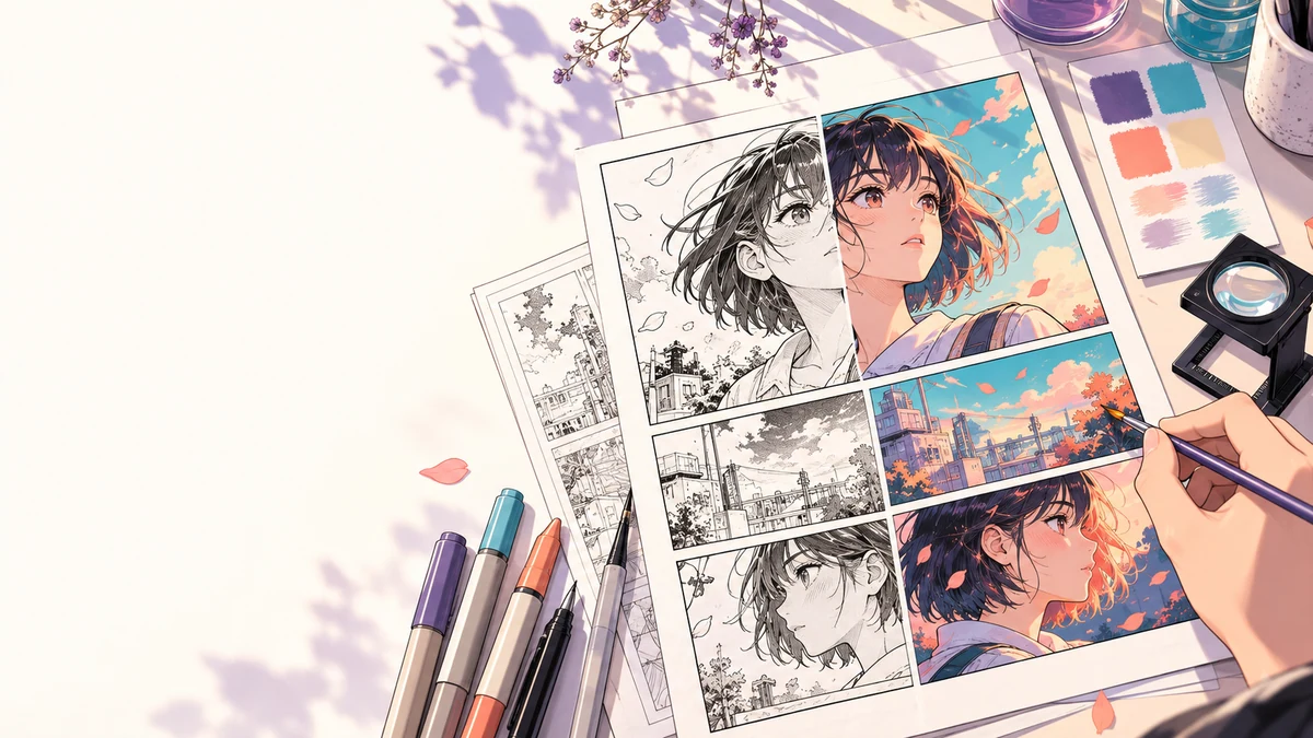
Start with a representative page
Do not begin with the cleanest portrait in the chapter. Pick a page that exposes the real production problems:
- a recurring character with visible hair, skin, and clothing
- at least one background or prop
- both large and small inked details
- speech balloons, sound effects, or captions
- shadows or screen tones that may compete with color
This page becomes the test for your palette, flat colors, lighting, and review process. If the workflow can handle it without damaging the ink or lettering, it is a much stronger signal than a polished face crop.
Keep the original file untouched. Work from a copy and save an editable master in your drawing application. If you use an assisted color pass, treat the exported image as source material for review, not as a replacement for that master.
Prepare the line art before adding color
Clean line art makes every later step easier. Check that the page is upright, cropped correctly, and large enough to inspect. Remove scanner dust and accidental gray marks, but preserve intentional texture. Thin facial lines and strands of hair are often the first details to disappear when contrast is pushed too far.
Separate lettering when your production file allows it. That makes it easier to correct a balloon or caption without repainting the art underneath. Keep panel borders and important sound effects visible as well.
Screen tones need a deliberate choice. You can preserve them as texture, reduce their opacity, or replace them with color and shading. Mixing all three approaches without a rule tends to create muddy pages. Decide how tones will behave on the test page before moving on.
If your editor supports reference layers, use them to keep fills inside the intended ink. Clip Studio Paint documents how reference layers can guide fill and selection tools. Its Fill tool documentation also covers gap closing and area scaling, which can help with small breaks in line art.
Build a palette before coloring the whole page
A palette is a production record, not decoration. Start with colors that must remain recognizable:
- skin and hair
- school uniforms, jackets, or other repeated clothing
- important props and effects
- recurring locations
- scene lighting colors
Name the swatches by purpose rather than appearance. “Main character jacket base” is more useful than “blue 4.” Add shadow and highlight variants only after the base colors are approved.
Krita's Palette Docker can store named swatches and foreground or background colors. The same principle works in other editors: keep the palette open beside the page and update it when a color decision changes.
Do not force every scene into one lighting scheme. The character's base colors can stay stable while sunset, indoor light, or magical effects shift the rendered result. Record both the base color and the scene adjustment so that later pages have a clear reference.
Choose the right first pass
There are three useful ways to begin.
Manual flats
Manual flat coloring gives the most control. It is a good choice when the line art contains open shapes, overlapping effects, or details that an automated fill may misread. Krita's flat coloring tutorial explains several selection and fill approaches for creating clean base areas.
Assisted color pass
An assisted pass can help you explore a direction or reduce blank-canvas work. Upload a clean representative image, generate one result, and inspect it at reading size. Look closely at faces, fingers, hair gaps, clothing edges, panel borders, and text.
You can test the page in the VividManga manga colorizer. The current download is a rendered image, not a layered PSD, a set of masks, or editable flats. Keep your own layered master if the project needs detailed correction or handoff.
Before uploading client work or unpublished pages, read the Privacy Policy and Terms of Service. Upload only material you own or are authorized to process. If a confidential project requires a specific retention or training commitment, resolve that requirement before uploading; the public policies do not make those specific promises.
Colorize one manga page here
Upload one black-and-white page, get a color result, then decide whether to process more pages.
PNG, JPG, or WebP under 5 MB works best.
Use this result to judge palette, line art, and speech bubbles before scaling.
Hybrid workflow
A hybrid workflow is often a useful compromise. Use a generated or rough color pass to discover possibilities, then rebuild or correct the accepted direction in your editor. This keeps the speed of exploration while preserving control over ink, palette, and layers.
Separate flats, shadows, and lighting
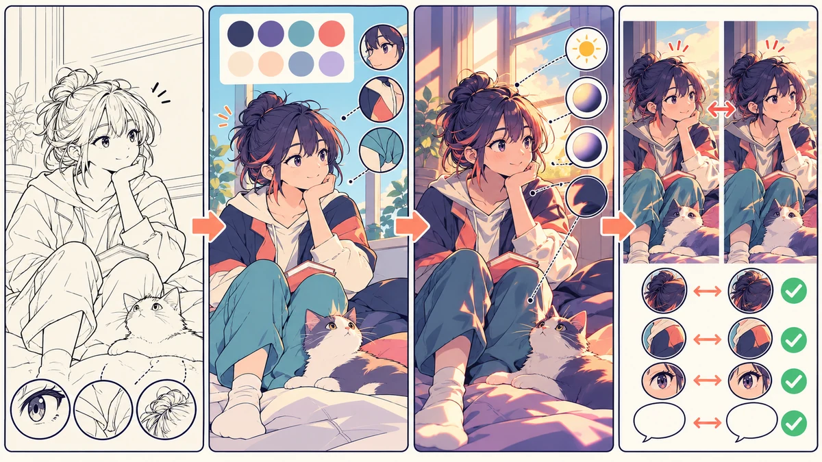
Trying to solve every color decision at once makes corrections expensive. Build the page in stages:
- Apply flat local colors.
- Correct boundaries and missed areas.
- Add form shadows.
- Add scene lighting and effects.
- Restore ink and lettering where needed.
For manual work, keep flats separate from shading. The flats layer should make selection and correction easy. Shadows can then describe form without changing the character's recorded base colors.
Clip Studio Paint's smart shading documentation describes controls for light position, shadow color, and reference layers. Even if you do not use that feature, the separation is useful: local color answers “what color is this object,” while lighting answers “how does this scene affect it.”
Use fewer shadow colors than you think you need. A clear shadow family usually reads better than many unrelated dark colors. Reserve strong accents for focal points, effects, and material differences.
Review what automation gets wrong
The first attractive result is not the finished page. Compare it with the line art and ask where the color changed the drawing's meaning.
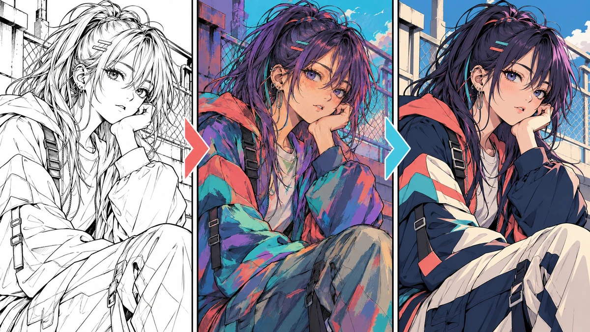
Common problems include:
- two adjacent objects merging into one color area
- eye whites, teeth, or highlights becoming skin colored
- hair gaps being mistaken for background
- speech balloons receiving unwanted texture or color
- screen tones turning into dirty shadows
- small props changing color between panels
- atmospheric light flattening the character's base palette
Correct these problems in an editor rather than repeatedly generating random alternatives. A useful correction log can be short: identify the panel, name the object, record the approved color, and note what changed. That record becomes valuable when another page repeats the same costume or location.
Check the page at its real reading size
Zoomed-in artwork can hide readability problems. Review the full page at the size readers will actually see. For a vertical comic, scroll through the panels in sequence. For a print page, check the whole composition and then inspect the smallest panels.
Pay attention to value contrast. Different hues can still collapse into the same gray value, making silhouettes and expressions hard to read. Temporarily previewing the page in grayscale is a quick way to spot this.
Check adjacent panels together. A color choice may look fine by itself but create an accidental jump when the camera angle changes. Hair, clothing, props, and location colors should feel related unless the story intentionally changes the light.
Lettering deserves its own pass. Confirm that balloon interiors remain clean, text has enough contrast, and colored effects do not cross important dialogue. Review translated lettering after color, because longer text can change the balance of a balloon.
Move from one page to a repeatable batch
Only expand the workflow after the representative page is approved. Save the palette, layer structure, export settings, and correction notes. Then select a small group of pages that share characters or a scene.
For larger jobs, the multi-page manga colorizer can help organize several source images after the visual direction is settled. Review the outputs as a sequence, not as isolated files. Batch processing can still vary character colors, so the palette and human review still matter.
Use stable filenames and keep source, working, review, and final exports separate. Do not overwrite your sole copy of the line art. If a revision arrives, you should be able to identify which palette and lighting decisions produced the current version.
A practical quality checklist
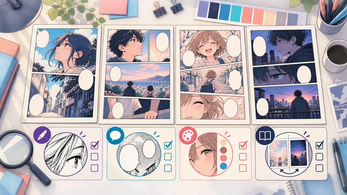
Before approving a colored page, verify the following:
- Ink: thin facial lines, hair strands, panel borders, and effects remain readable.
- Palette: recurring skin, hair, clothing, and prop colors match the approved references.
- Flats: adjacent objects are separated and no small areas are missed.
- Lighting: scene color changes are intentional and do not erase local color logic.
- Lettering: balloons, captions, and sound effects remain legible.
- Sequence: neighboring panels and pages feel visually continuous.
- Rights: the source artwork is yours or you have permission to process it.
- Files: the original and editable master are preserved separately from the rendered export.
Common mistakes and better fixes
Coloring every page before approving a palette
This multiplies corrections. Approve one demanding page first, then reuse the decisions that survive review.
Treating the generated image as a layered production file
A rendered image is useful for direction and review, but it does not contain editable flats, masks, or named layers. Rebuild important decisions in your editor when the project needs controlled revisions.
Solving inconsistency with more random generations
More variations do not create a production standard. Record the approved palette, correct the selected pass, and compare recurring elements side by side.
Ignoring text until the end
Color can reduce text contrast or introduce noise inside balloons. Keep lettering visible during review and test it at reading size.
Using artwork without clear permission
Colorization changes a source work but does not remove the source creator's rights. Use your own pages, licensed material, or artwork you are explicitly authorized to process.
Final takeaway
A reliable way to colorize manga is to make the workflow testable. Use a representative page, protect the ink, define a palette, separate flats from lighting, and review the result at real reading size. Once that page is stable, the same decisions can guide the rest of the chapter.
AI-assisted coloring can shorten exploration, but it does not remove editorial judgment. The finished result still depends on clean source art, documented color choices, careful correction, and a person who checks the page as part of a sequence.
Frequently asked questions
What is the difference between manga coloring and manga colouring?
They describe the same process. “Coloring” is the common US spelling, while “colouring” is common in the UK and other regions.
Can I color manga panels without redrawing the line art?
Yes, if the source is clean enough to separate shapes and preserve details. Keep the original line art available so you can restore thin ink or repair edges after the color pass.
Should I remove screen tones before coloring?
Not necessarily. You can retain them as texture, reduce them, or replace them with color and shading. Choose one approach for the test page and apply it consistently.
Can an AI manga colorizer keep a character consistent?
It can provide a useful direction, but do not assume colors will be identical across separate images. Use an approved palette and compare recurring features across neighboring panels.
Is the VividManga download a layered file?
No. The current output is a rendered image. Keep or create a layered master in your drawing application when you need editable flats, masks, shadows, or lettering.